

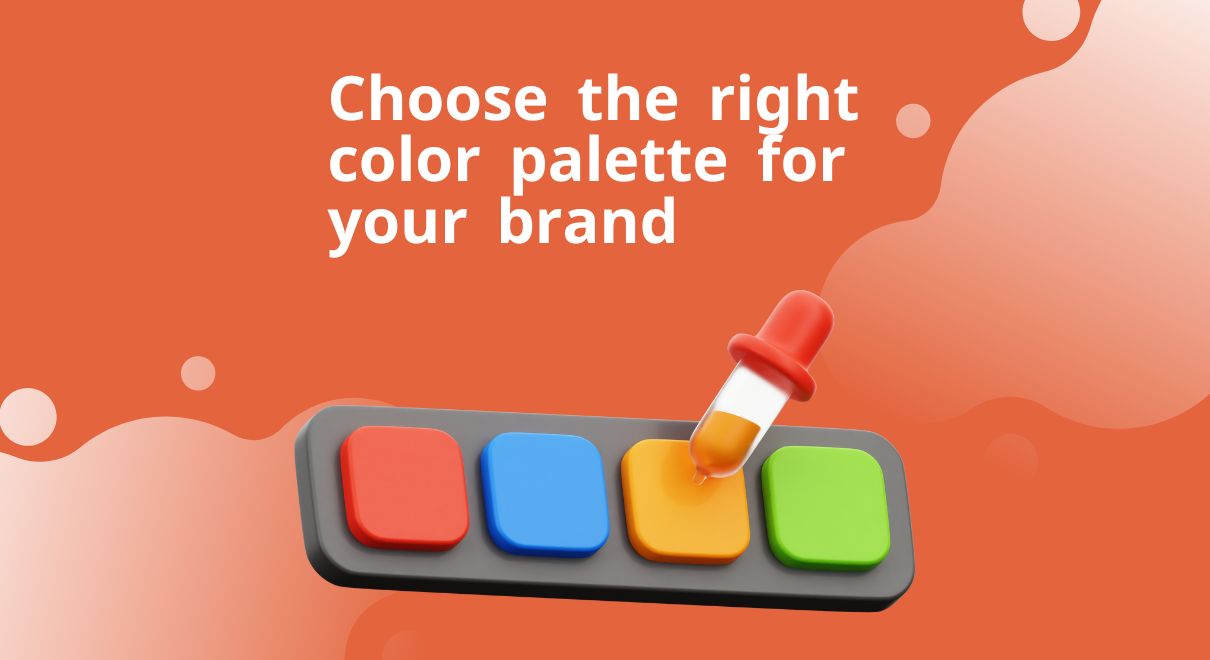
Choosing the Right Color Palette for Your Brand: Tips and Best Practices
Selecting the right color palette for your brand is a critical decision that impacts how your audience perceives and connects with your business. Colors evoke emotions, convey messages, and significantly influence consumer behavior. In this blog, we will explore the steps to choosing the right color palette for your brand, along with tools and resources to help you generate the perfect color scheme.
Understanding the Importance of Choosing the Right Color Palette for Your Brand
Before diving into the process of choosing the right color palette for your brand, it’s essential to understand why color is so crucial in branding:
- Emotional Connection: Colors evoke specific emotions. For example, blue often represents trust and reliability, while red can signify passion and urgency.
- Brand Recognition: Consistent use of colors helps in brand recognition. Think of Coca-Cola’s red or Starbucks’ green.
- Consumer Perception: Colors can influence how consumers perceive the quality and credibility of your brand.
Steps to Choosing the Right Color Palette for Your Brand Identity
- Define Your Brand’s Core Values and Personality
Start by clearly defining your brand’s core values and personality. Ask yourself:
- What are the key values your brand stands for?
- How do you want your customers to feel when they interact with your brand?
- What is your brand’s personality – is it playful, professional, innovative, or traditional?
- Understand Color Psychology
Color psychology studies how colors affect human behavior and emotions. Here are some common associations:
- Red: Energy, passion, excitement.
- Blue: Trust, reliability, calmness.
- Yellow: Happiness, optimism, warmth.
- Green: Nature, health, tranquility.
- Purple: Luxury, creativity, wisdom.
- Black: Sophistication, elegance, power.
- White: Purity, simplicity, cleanliness.
Choosing the right color palette for your brand involves selecting colors that resonate with the emotions and values you want to convey.
- Analyze Your Target Audience
Your target audience’s preferences and cultural background can influence color choices. Conduct research to understand the demographics of your audience:
- Age, gender, and cultural background can all influence color preferences.
- Consider the industry you are in, as different sectors have different color norms.
- Study Competitors
Analyze the color schemes of your competitors. This will help you understand the industry standards and find ways to differentiate your brand. You don’t want to blend in; you want to stand out while still fitting into your industry’s context.
- Create a Mood Board
A mood board is a visual representation of the emotions and ideas you want your brand to evoke. Collect images, colors, textures, and fonts that resonate with your brand’s personality. This exercise will help you visualize the overall feel and direction of your brand’s aesthetic.
- Choose a Dominant Color
Your dominant color is the one most associated with your brand. It should reflect your brand’s primary values and personality. This color will be the most prominent in your logo, website, and other marketing materials.
- Select Complementary Colors
Once you have your dominant color, choose 2-4 complementary colors to create a cohesive palette. These colors should work well with your dominant color and be used for secondary elements like backgrounds, buttons, and accents.
- Test Your Color Palette
Before finalizing your color palette, test it in various applications. Create mockups of your website, social media profiles, and marketing materials to see how the colors look together. Ensure that your palette is versatile and works well in different contexts and on various devices.
- Get Feedback
Gather feedback from stakeholders and potential customers. Their insights can provide valuable perspectives and help you refine your color choices.
Tools and Resources for Generating the Right Color Palette for Your Brand
- Adobe Color
Adobe Color is a powerful tool for creating and exploring color schemes. It offers various color harmony rules like complementary, analogous, and triadic, helping you generate palettes that are aesthetically pleasing and balanced.
- Coolors
Coolors is an intuitive color scheme generator that allows you to quickly create, save, and share color palettes. You can explore trending palettes and adjust colors with a user-friendly interface.
- Canva Color Palette Generator
Canva’s color palette generator lets you upload an image, and it will extract the dominant colors to create a cohesive palette. This is particularly useful if you have a brand image or mood board that you want to base your colors on.
- Colormind
Colormind uses deep learning to generate color schemes based on real-world examples. It’s a great tool if you’re looking for inspiration or unique combinations that you might not have thought of.
- Paletton
Paletton is designed for creating harmonious color schemes. You can adjust hues, saturation, and brightness to fine-tune your palette, and it provides live previews to see how your colors will look together.
- ColourLovers
ColourLovers is a creative community where you can explore color palettes created by others, get inspiration, and even share your own palettes. It’s a great resource for finding trending color schemes and seeing how different combinations are used in real projects.
- Material Design Palette Generator
If you’re designing for digital interfaces, Google’s Material Design Palette Generator is a fantastic tool. It helps you create color schemes that adhere to Material Design guidelines, ensuring your UI is both beautiful and functional.
Best Practices for Using Your Color Palette
- Consistency is Key
Ensure that your color palette is used consistently across all your branding materials. This includes your website, social media, packaging, and any other customer touchpoints.
- Accessibility Matters
Make sure your color combinations are accessible to all users, including those with color blindness. Tools like the WebAIM Contrast Checker can help you ensure sufficient contrast between text and background colors.
- Keep it Simple
Avoid using too many colors. A palette with 3-5 colors is typically sufficient and helps maintain a clean and professional look.
- Update as Necessary
As your brand evolves, you may need to update your color palette. Keep track of design trends and consumer preferences to ensure your brand stays relevant.
- Document Your Choices
Create a brand style guide that documents your color palette, including HEX, RGB, and CMYK codes. This ensures consistency and makes it easier for anyone working on your brand’s design to use the correct colors.
Conclusion
Choosing the right color palette for your brand is a strategic decision that requires careful consideration of your brand’s identity, target audience, and industry context. By following the steps outlined in this blog and utilizing the available tools and resources, you can create a color palette that not only looks great but also effectively communicates your brand’s values and personality. Remember, choosing the right color palette for your brand is more than just a visual element; it’s a powerful tool that can shape how consumers perceive and connect with your brand.